


Playing with Shape and Colour
Spoon & Folk / Branding Exercise
We were asked to help brand a new eatery not far from our office. A friendly non-pretentious place where people could hang out with friends or meet new ones. What attracted us to this project was that it went far beyond branding your standard eat-in take-out establishment. There are several watering holes with the moniker ‘community hub’, but this venture truly lived up to that label. The owner was a chef and part-time social worker and her establishment offered healthy holistic meals, therapeutic cooking classes, guest speakers on nutrition, frozen prepared meals, as well as the usual fare; musical entertainment, board game night etc.
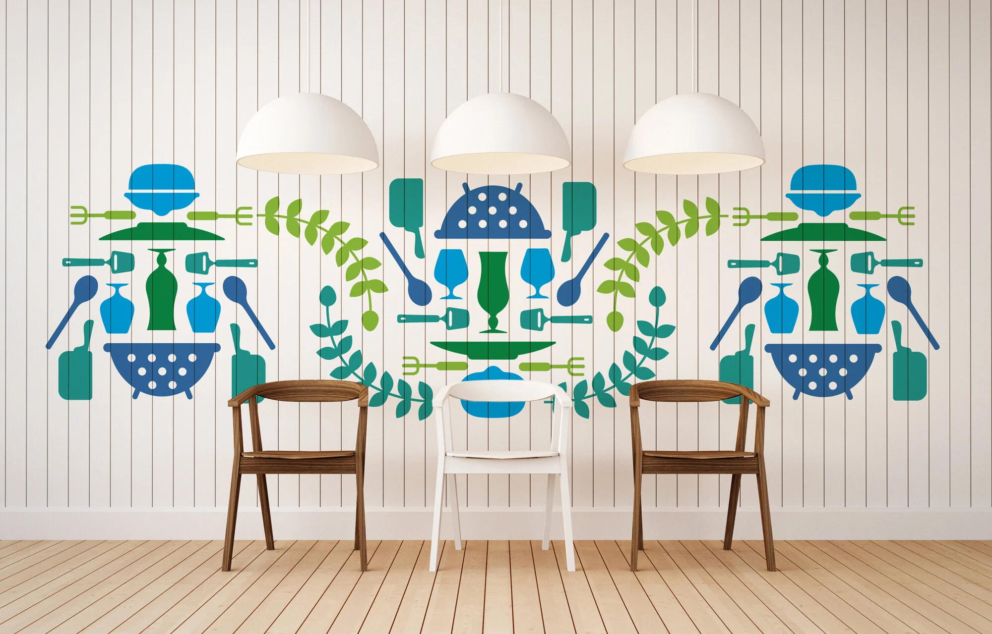
To play up on the idea of being together and sharing a meal or story the name Spoon & Folk was coined —a play on the familiar spoon and fork. The whole vibe felt warm and comfortable like a visit to your grandma’s kitchen complete with needlepoint trivets. So we played with the idea of folk art and created patterns that felt inviting, fun, unique and flexible to work with. We also rendered the type in a primitive font to complete the look.
This was one of several concepts we did exploring colour, patterns and motifs. The client eventually chose another one of our concepts, but we really enjoyed the whimsy of this direction.
Project Scope:
Branding
Art Direction
Interior Design
Illustration